(Initially) I began writing this post when the Dow Jones was down 300 points on January 30, 2018. The previous day (January 29th), the Dow was down 177 points.
Through January 30, 2018, the Dow Jones had not seen a 1% drop in 111 days, one of the longest runs in history. I remarked “as investors, we have been spoiled, because the market has not had a 5% or greater drop since the middle of 2016 (at that point, that was eighteen months past). Even a 500 point drop (between yesterday and this morning) adds up to roughly a 2% drop.
Additionally, Tim had been reporting in our daily meetings how remarkably over-bought the markets became. It’s hard to recall seeing a market get this skewed to the over-bought side.
The focus of this piece is to show (visually) how over-bought and over-sold markets can work themselves to extremes. With the help of Dorsey Wright, and their “distribution curve” we will be able to visualize how markets can move to extremes.
One of the points I’ve learned is without volatility in both directions, markets can reach over-bought or over-sold conditions quickly. Having some degree of volatility “against the trend” tends to help keep markets in “neutral territory” – providing opportunities for investors to buy and sell.
Most of this can be understood by looking at different classes of the market plotted on a bell-curve, as Dorsey Wright does very well. When an area (or asset class) of the market gets skewed to the right side, it is said to be over-bought. Skewed to the left side, over-sold. Most of the time (roughly two-thirds) results for most bell curves seem to fall in the center – or to the immediate left or right of the center. It’s the remaining one-third of the time where markets can get outside the normal areas of the bell-curve and become skewed to the left or right, over-sold and over-bought.
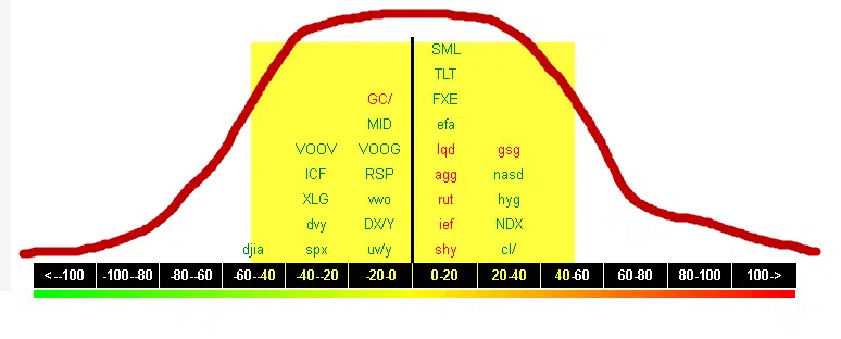
Here is a normal looking distribution curve, below. This is from September 2016. Notice how most of the different classes are centered around the middle? As prices get stretched in either direction, asset classes will begin to skew toward the over-bought or over-sold side of the picture.
Below I have taken that same distribution curve from September 2016 and crudely hand-drawn in a red bell-curve. This is to help give you an idea of where things fell in September 2016. I have also highlighted the area (in yellow) showing a “normal distribution” – some assets appear over-bought, some assets appear over-sold. But no asset class reaching any kinds of extremes.
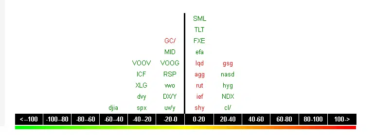
By contrast, here (below) was the distribution curve on January 29, 2018. Most equity-oriented asset classes (domestic and international) were skewed FAR to the right, indicating massively over-bought conditions. If you believe it’s wise to buy equities (stocks) at the right price, this was the time to put your “equity shopping list” away.

In fact, most of the symbols skewed toward the middle of the curve, and to the left were left out of the “equity rally” seen the last few months. Some of those symbols in the center and toward the over-sold side (above) include the US Dollar, and many bond investments. As rates began to rise the last few months, these asset classes began stretching to some over-sold levels.
What happened the next few trading days following January 29-30, 2018 was very enlightening. Stocks (not only in the US, but around the globe) sold off. There are two ways an “over-bought” condition can be resolved:
- The market can simply go down.
- The market can “stall” and trade in place over a period of a few weeks, or months.
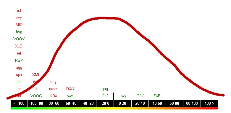
Without revisiting the gory details, markets sold off violently. Most US-based indices were down (approximately 10%). Now, here is what the very same distribution curve looked like on Friday February 9, 2018. This is just eight trading days later:
For the record, these kinds of immediate swings from over-bought to over-sold do not typically happen.
What was left in the middle of the bell-curve? Commodity investments like crude oil, gold and other commodity-related indices. What has skewed toward the over-sold side of the bell curve? Nearly all of the equity-related assets (which were previously over-bought). But also look: bonds, fixed income investments and the US Dollar remain over-sold. Interesting.
Markets reach over-bought and over-sold levels many times, and markets correct themselves — often without folks even being aware of the underlying conditions.
Our friends at Dorsey Wright & Associates remind us the market typically generates a 5% pullback between three and four times a year on average, and the market also averages one 10% pullback per year, over now nearly 100 years, dating back to the 1920’s.
What we missed in 2017 was volatility. We had one of the “quietest” years in recent history: very few big sustained drops, and not a single 5% drop at all during the entire calendar year. It’s normal to expect some volatility, and I suspect we will see “our old friend” volatility return to the markets in 2018.


