Prepare for a hot take: the earth is a sphere.
Now that I’ve lost all the flat-earthers, let me continue. Since the earth is a sphere, we cannot perfectly map its surface. Despite this, we’ve persisted in translating our three-dimensional world onto a variety of two-dimensional surfaces.
We don’t really have a choice. In order to navigate larger areas, we must shrink, shift, and warp details into digestible formats. Sometimes, this creates discrepancies.
For instance, check out this image that shows the relation between a Mercator map projection and the true size of each country:

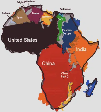
And this one, that shows how understated that makes the size of Africa:
This isn’t to say that all maps are bunk or that their creators are disingenuous. Maps are subjective. Maps are abstractions. Maps tell us as much about their their makers as they do about reality.
The most important thing we can understand about a map is what it was designed for. This gives us a clue as to whether it will be useful to us or not.
This principle rings true for investors, as well.
The most important thing we can understand about market information is what it was designed for.
Short term market information was not designed to benefit the long term investor. In fact, you could make the case that this information often does more harm than good. It seems exactly backwards that the least relevant market information is normally the most readily accessible to us. But for whatever reason, we’ve been convinced that daily, monthly, or quarterly investment performance is a good way to track long term success.
I understand that, added together, days, weeks, and months become our long term reality. However, this still seems like an informational mismatch considering that, as Cullen Roche describes in this post, stocks are inherently long duration assets. When short-term feedback loops get applied to long duration assets, mistakes are sure to be made.
Most of us would be better off receiving market information in a format like this:
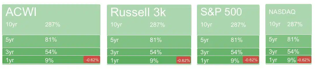
Shout to Dan Egan of Betterment for creating this: https://twitter.com/daniel_egan/status/1055892147172507649
What we see is all there is, and when all we see is short term information, it’s easy to get sucked in. Viewing short term information in the context of the bigger picture would be a helpful improvement for most.
But whether we look at daily market returns or rolling ten year performance, the numbers are the numbers. It’s what we do with them that matters.
The right feedback loop should keep you informed enough to know, but not enough to go insane. This is subjective, and finding that balance is easier said than done. The interval at which we seek feedback probably says as much about us as it does about reality.
The good news is that we’re in control. The bad news is that we’re in control.
It’s a blessing and a curse: we’re the cartographers; we make our own maps. Choose your feedback loop wisely.


